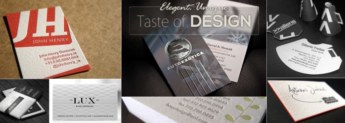
Business card design guide
Business cards means a lot for a company or single bussiness man. This is why it is a wise investment for the best designed business cards. It is important to consider the impression you wants to make and your personal taste when chosing the paper stock, font, ink color, and whole artwork layout for your business card. The following are some aspects to be rememberd during the design process.
Paper stock
The paper stock that your business card is printed on is important. Generally speaking, business card paper should be durable and impressive. And more, the paper stock needs to be tuff: high quality paper stocks are important. And last, you need to think about the size, shape, and color of the card. The paper thickenss usually are 14pt, 16pt, 24pt, 32pt. Most people could go for a traditional rectangle shape in 3X2.5inches or could be creative cards that folds out or comes in the shape of a circle or a heart. The type of paper should reflect the mission or focus of the group as well as the intended audience.
Font
The font and information on a business card is very important. The information presented on business card determines how a receiver knows about the card holder and also contact info. Website, email , phone number can be printed on the front. Sometimes, people even have the back printed with logos or company slogan or even coupons. And since 2015, a new form of barcode alled QR code is becoming a new element to include on the business card. The type of font used for the information and its color and layout affect the design theme and overall impact. This is why it is important to play around with business card printing options.
Images and Text
It is important to always think about the balance between images and test. Does one’s company have a logo or image that represents it? Does a person want to include a symbol to represent their career or industry (i.e. a car to represent a mechanic or a pen to indicate a teacher or writer)? A business card isn’t super large in size. Thus, it is important to think about the placement of the image in relation to the text. Business cards should be easy to read and memorable.
Audience
Professionals should think about what they are trying to present with a business card and audience group. For example, someone in the wallstreeet may want a design that is clear, polished and classic. A web designer may want something more creative, colorful, and original. The card needs to consistant with the needs of the card holder as well as his field.
Turn it up
Great business card design isn't limited to horizontal layouts. Often, a vertical layout is enough to make your business stand out, because it suggests a creativity and professionalism that set you apart from your competition. Consider using a photo or logo at the top that fades away to the business card's background and text, or place the text on top with a definite line or color contrast between text, the logo and tagline. You could also experiment with a line or a wave, diagonally cutting across the business card, or use the traditional horizontal business card design elements and simply re-order them to look great in a vertical layout.
Get it into shape
Straying from the traditional square-cornered rectangle makes your company stand out to potential clients before they even take a look at the information on your business card. One innovative business card design idea is to use a die-cut card. One, two, three or four rounded corners are popular; as is a tabbed shape with notches designed for fitting in a Rolodex. If you want to get really extreme, you can use ashape that relates to your business. For example, a wrench- or hammer-shaped business card for a contractor or a cow-shaped business card for a farmer would capture a potential client's attention.
Make it useful
One way to ensure your business card will stay in the collective wallets, purses, Rolodexes and kitchen drawers of prospective customers is to make it useful beyond your contact information. The back side of the business card is a great place for putting value-added charts, diagrams, schedules and other information. A mortgage company, for example, might include a chart that depicts mortgage payments relative to a home's value and current interest rates. Radio and television stations, golf courses, bowling alleys, bands and other businesses could benefit from a list of events, or a schedule of a local sports team whose games are broadcast on their station or viewed at their facilities. The information doesn't have to be completely tied in to the business either - a car insurance company could increase brand recognition by listing popular attractions within driving distance.
Break the rules with elegance
You don't want to go overboard when it comes to the actual graphic design and layout of your business card, but that doesn't mean you can't have a little fun and be original. Think of all the color combinations, patterns, photos, layout orders and shapes that you can use in your creative business card design. It's a good idea to browse around to find inspiration from designs you already like, and then go back to the drawing board and experiment. Do you want to be bold or subtle? What shapes, colors and patterns look great with your text, logo and photos? If you create a business card you love, show it to others around the office, and even friends, family and loyal customers to get their input. No matter what design rules you find online, remember that they're made to be broken. If it looks great, keep it!
Spin the color wheel
Despite the fact that digital color printing is vibrant and inexpensive, many businesses stick with old-fashioned black and white cards. Unfortunately, that means these businesses have a difficult time standing out in a rolodex. If you want people to remember you, your business card must make an immediate and lasting impact. The best way to do this is by intelligent use of color.
First and foremost, the colors on your business card should match the colors in your logo for a consistent, branded effect. After that, you should use a color wheel to find complementary colors with great contrast and high aesthetic appeal. Sticking to the proper color combinations will help ensure that your card doesn't look gaudy or unprofessional.
Just because you use the standard color wheel to choose your colors doesn't mean you have to use your colors in a standard layout. Try straying from the norm with squiggly lines or a polka-dotted or checkerboard background. You use colors to outline images, accentuate text or even outline the entire card. The point is to be unique enough to stand out and stylish enough to look professional and classy.
Combine colors and shapes
Even though your business card is probably a 2.5-inch by 3-inch rectangle, your card's design doesn't have to follow that square format. Try using circles, ovals, triangles and octagons in your design. You could put your contact information inside a circle, for example; or put a photo inside a triangle. Again, the goal is to be unique and classy to help your card make an immediate impact.
Colors can outline or fill your shapes, and this gives you an excellent opportunity to experiment with different hues, gradients and other filters to make your business card stand out. You can also put a shape within a shape, as with concentric rings, for a striking design that looks great.
Think outside the box
Who said your business card has to be a rectangle anyway? Some of the most unique business cards are die cut to relevant shapes. A locksmith might have his card die cut into the shape of a key, for instance; or a pet groomer's card might be shaped like a dog. Some companies even have their cards die cut to fit in a rolodex. If you're not comfortable with a fun shape like these examples, or if it would be deemed unprofessional in your industry, take a more subtle approach: Have one or more of your card's corners rounded or angled so that your card retains the basic rectangle shape, but adds a touch of flair.
Designing business cards that stand out is simple if you follow a few simple rules: Pick the right colors, use them creatively and add shapes for aesthetic appeal. It doesn't hurt to bend the rules once in awhile if you have a great design that works, because a unique business card gets noticed, and it's your job to make sure it's getting noticed for the right reasons.
Be bold, yet be subtle
Most people are accustomed to seeing traditional fonts on everything from billboards to newspapers, so much so that very few headlines do a good job of catching their attention. You can help your clients'business cards get noticed by using fonts that subtly stray from the norm. They are still easy to read but off just enough to grab and hold a reader's attention a little longer. This doesn't mean you should go crazy with Wing Dings, but you can scope out fonts that look similar to traditional fonts but are bolder, thicker, taller, skinnier, shorter or even slanted. These are your power fonts, and they'll go a long way to setting your clients - and you - apart from the competition.
Draw attention
Use power fonts to emphasize the focal point of the business card design. Is it the company name or the individual? Does the logo already use a power font, and can it be used in place of the company name? Power fonts should be used for large text elements like taglines, logos, company names, or individual names; and these elements should be set apart from the rest of the business card text to attract as much attention as possible. Contact information and other small elements could become difficult to read if not in a standard font, but that doesn't mean you shouldn't experiment.
Match the business
When choosing a power font, see if it matches the business of the card it's going to go on. Elephant might look great on a business card for a hot, trendy night club while Agency might help a technology firm stand out. Script fonts like Forte and French Script can be good choices for taglines, depending on the industry.
Mix it up
Power fonts often look great when formed into a shape, like a circle or triangle; or placed vertically or diagonally on the card. Experiment with different layouts, shapes, and placement to get the maximum exposure for your power font elements - and remember to have a little fun with it.
Power Fonts
Here's a short list of some popular power fonts. There are many, many more - a quick look through your favorite design program's fonts should yield dozens or even hundreds of options.
Custom options:
Several products use the same setup process below, including:
Custom option example
In the following article, we will use setup separations for the Spot UV business card shown below – note the Spot UV glossiness over the cat illustration on the front, and the stripes on the back in Spot UV.
Step 1: CMYK Files
Follow the guidelines for setting up regular CMYK files. Some products (such as Premium Black) will not have CMYK files – if ordering one of those products, you may skip this step.
Export a press-ready PDF file for the front and back CMYK printing of the card, front and back. These files should have "Front" and "Back" at the end of the file name (for the front and back respectively). These files will not include any details for the additional print treatment.
Step 2: Define Separation/s
For this step, we will create a black and white file for the separation. This can be done in many ways in your design program – by setting up new layers, defining a new artboard (new page) or creating a separate file.
The areas for treatment (spot UV, foil, emboss etc.) will need to be defined in black ink, and areas for no treatment will be white. The black colour used must be CMYK Black only – with no grey colours, or other inks.
For the best outcome, and easiest process, we recommend creating the design in vector-format (such as in Illustrator or InDesign). Creation in a pixel-based format (such as Photoshop) is possible in the same manner, but can become difficult.
K100 Black
CMYK: 0, 0, 0, 100 |
.png) |
|
Example

Cats_Set1_Front.pdf |
.png)
Cats_Set1_Back.pdf |
.png)
Cats_Set1_Front_UV.pdf |
.png)
Cats_Set1_Back_UV.pdf |
|
Each different treatment will need to be defined in a different separation file. For example, if you are setting up one order for Spot UV and embossing, you will need UV and EMBOSS files. For multiple sets, use the same naming convention but change the set number as appropriate (ie. “Set2_Front.pdf”, "Set2_Back.pdf" etc.).
If you are only ordering a treatment on one side of your card, only supply the front file for UV, EMBOSS, DEBOSS or FOIL (ensure any corresponding CMYK artwork is also set up on the Front.pdf file).
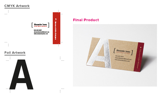
Foil stamp exapmle:
As shown above, the file on the left is the normal CMYK print file. We chose all ink to be in foil which you will see on the right. The colors you want in Liquid Foil, the mask file should look like the file on the right. The White indicates no foil and 100% K indicates where the Liquid Foil will be. When processing your order, you will be asked to upload a mask file for the specified print option selected. Separating a mask file from your print file can seem very difficult, but is actually really simple! A mask file is a white background with the print option filled with 100%K (black ink). The process of setting up a mask file for different print options is pretty uniform.
Here are some more things to keep in mind when creating your Liquid Foil artwork:
- – Make sure the mask and CMYK print file are aligned and match up properly.
- – Liquid Foil works best on lighter colors. The darker the CMYK color, the less the Liquid Foil look.
- – Do not use very thin or small text and artwork with Liquid Foil. Use san serif fonts above 12 point for best results.
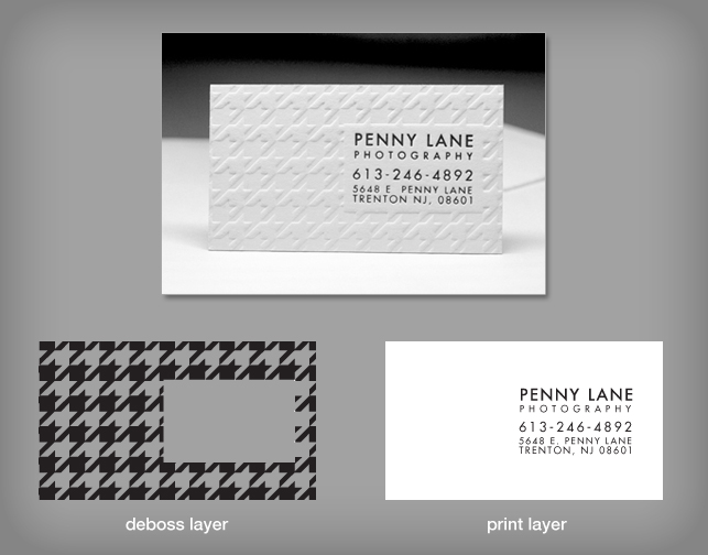
Debossing example
Once you have decided what you would like debossed, create an additional layer within the design document, or a separate file. After you have created the new layer or file, label "deboss". Please color the layer 100% K (black).
hether stuck in a homeowner's kitchen drawer or neatly filed in a business executive's Rolodex, just about everyone has a collection of business cards. As one of the simplest and most endearing forms of advertising, the business card must pack a powerful punch in a small space. All great business card layouts should include important contact information and incorporate a clean, easy-to-read design, so it can be difficult to make your card stand out from the competition.
Here are a few creative business card design ideas sure to spark your creativity and help you design hot business cards that'll leave a professional and lasting impression on potential clients.
Your business card is your No. 1 marketing tool and can make an important, lasting impression. Make sure your business card – and your company – gets attention in a positive way.
You know the old saying, “You can never be too rich or too thin.” Well, that’s not true for business cards — the thin part, that is. Our 16-point paper stock is ultra-thick and feels sturdy in your hands. You can also add a UV coating to your cards for a glossy shine that also holds up to wear and tear.
Our 15-point velvet cover stock is thick, too. Plus, it features a velvety smooth finish and semi-matte look with 10 percent recycled content.
Uncoated business cards are easier to write on than coated business cards, which make uncoated business cards perfect for anyone who uses business cards as appointment cards such as doctors, dentists and salons.
Some of the most unique business cards are die cut. If you want to add a little bit of shape to your business card, but don’t want to go full die cut, you could try a rounded corner business card.
Opting for an unusual shape, such as a jumbo business card, a slim business card, a square business card, is a great way to guarantee that your business card will stand out in a rolodex.
Knowledge base:
EMBOSSING
Embossing is a unique process using plates and pressure to create
a raised detail on one side of a business card. This finishing pushes
through the paper to create a finishing that is visible from 360
degrees. Embossing creates a reversed deboss of the image on
the opposite side of the card. Embossing can be combined with
foil stamping, ink or can be “blind” meaning that no further finishing
is used on top of the emboss.
Considerations:
Embossing is ideal for designs with buffer zones of at least 2mm.
Embossing is recommended to be used on cardstocks that are no
more than 30pt or less although it is still possible.
While it is possible to emboss the card before gluing to avoid a
complete reverse deboss on the other side for an additional
charge, this is not recommended since it may still leave a slight
indentation due to the way the glue dries.
DEBOSSING
Debossing is another one of our processes using plate and pressure.
Instead of applying enough pressure to push through the
cardstock, only enough pressure is used to create an indented
look. This finishing can also be combined with foil, printing, or can
be left “blind” for a more subtle look. White debossing can be
applied to all but our coated cardstocks (Silk and regular suede)
Considerations:
Debossing should be used on cardstocks thicker than 30pt as it
may leave slight marks on the other side of the card from the
pressure.
The very edges of the document are called the bleed area. To prevent an unwanted white border from showing at the edge of your document, be sure to extend any background colors or design elements all the way to the edge.
Trim lines are the finished size of the document. The document is cut close to the trim line, but because of the mechanical tolerances involved in printing, the actual cut can happen anywhere between the bleeds and the safe margin. This is why it is important to keep your text and important images within the safe margin.
When to create your document at the full bleed size
If you are working in an illustration program (such as Adobe Illustrator or Corel Draw) or a photo editing program (Such as Adobe Photoshop or Corel Photo-Paint), we recommend that you create your document at the full bleed size. This will prevent any white edges from showing at the borders after the final product is trimmed.
When to create your document at the trim size
If you are working in a layout program (such as QuarkXPress or Adobe InDesign) we recommend that you create your document at the trim size and include the specified amount of bleed for your product (.137”). When you export your document as a PDF for upload, make sure to include the bleed in your output settings so that the final upload PDF document is at the full bleed size for your product.
The safe margins are borders that are definitely inside the place where the cut will take place. Please remember to keep all important information, like names, addresses, phone numbers or logos within the safe margin (at least .137” from the edge) to ensure that they aren’t cut off when your document is trimmed.
The aspect ratio of your image can be determined by dividing the image’s width by its height. If your image’s aspect ratio is not equal to the aspect ratio, your image may appear stretched or distorted when it is scaled to fit.
What is resolution?
Resolution refers to the number of dots per inch (dpi), or the amount of detail the image has. Most documents prepared for upload should be 300 dpi at 100% of the final print size. Higher resolution means a more detailed image, and also larger file and longer upload time.
When saving a document in Portable Document Format (PDF) using Adobe Acrobat Distiller, please download our Adobe Acrobat Distiller settings (recommended).
CMYK (Cyan, Magenta, Yellow and Black) are the colors used in the printing process, whereas RGB (Red, Green and Blue) are the colors used by screen displays such as your monitor. Please note that JPEG files are almost always in RGB.
Your document should be created in CMYK mode so that the colors that you see on the screen most closely match the final printed product. If you create your document in RGB, the colors in your printed product may vary slightly. Many of the bright values produced by your monitor cannot be reproduced in print.
Fold marks indicate where the fold will take place on such products as brochures, folders and envelopes. If you don’t want your copy or design to be printed over the fold, make sure they stay within each panel’s safe margin.
Converting Fonts to Outlines |
|
Text can be converted to curves (paths) in some graphics programs. This will fix upload errors that result when fonts are not embedded in your file. Following these easy steps will help ensure that your text prints clearly.
How to convert fonts to outlines in Adobe Illustrator
- Select all text.
- Click Type Menu> Type> Create Outlines
- Text now has a blue outline.
- Save a copy and re-upload.
What are Vector Images?
Vector images use mathematical equations to define each component of an image. This allows vector images to retain their high-quality at any size. When possible, use vector graphics created in a desktop publishing program.
What are Raster Images?
A raster image is composed of a collection of tiny dots called pixels. When these pixels are small, and placed close together, they fool the eye into forming a single image. Raster images work well when subtle gradations of color are necessary. Because they contain a fixed number of pixels, a major disadvantage of raster images is that their quality suffers when they are enlarged or otherwise transformed. They are also large in file size.
Digital Imaging
You may create printed products on our web site using digitized images from a variety of sources. Your designs, photos and images can come from a digital camera, scanner, or the Web.
Any image you plan to use must be saved at approximately 300-dpi at 100% output size for the very best printing results. It’s helpful to know that shrinking an image on a product will increase its resolution. For example, an image captured at 600 x 900 pixels has 150-dpi at 4” x 6”. However, it can be printed at 300-dpi by reducing its dimensions on the product to 2” x 3”.
Images from a Digital Camera
If you wish to use images from a digital camera, before you snap pictures make sure the camera is set at a high enough resolution to result in 300 DPI at the intended photo print size. Most cameras have various settings for resolutions. The highest resolution for your camera depends on how many megapixels it has.
You cannot increase the resolution of a photo after it is taken, except by reducing its printed dimensions (after you upload the image). Be careful when cropping a photo after it is taken. Cropping will reduce the number of pixels in the final image.
Images from a Scanner
Like a digital camera, a scanner must be preset to the proper resolution before image capture. Many scanners default to 150-dpi (or spi). Set your scanner’s resolution so that it results in 300-dpi at the image’s final print size. If your resulting scanned image is smaller than the recommended size or has less dpi than you need, you should either rescan your original at a higher resolution, or use the image for a smaller printed area.
Images from the Web
Images found on the web are typically at a resolution of 72-dpi. This resolution is much too low for quality printing. In addition, most images on the web are protected by copyright laws. For these reasons, we do not recommend using images from the web.
|