Plastic card design guide
Plastic cards are an essential, but often overlooked, part of life. We all have a myriad of plastic cards in our wallets and handbags, using them for everything from gym entry to credit card transfers. Each type of plastic card, and each company or other organisation that needs its own plastic cards, is different. Fighting for space and attention among others in a crowded wallet, a good plastic card should be easily identifiable. How can designers of plastic cards make sure that theirs stands out?
General design principles
While every card, and every business, is different, there are some basic design principles that should be followed when it comes to plastic cards of any description. Firstly, think about whether the card is easy to read. Sounds basic, but it can be very tempting to try and squeeze so much on to a card that it is hard to read. Try and keep information to an essential minimum: think what your audience really needs to know, and give them that. Having a prominent web address on the card means they can easily go and find out more if they want to. Contact details in general should be easy to find, although they don't have to be on the front: they could be on the back of a card, with the logo dominating the front.
Think carefully about colours and logos. Having lots of small text is hard to read, as is having text which is not contrasted enough from its background. The same goes for logos. They should normally be kept away from the margins of the card, to keep the edges clean. They should be simple and printable: if your company has a complicated 3-D logo, then think about how it could be flattened to print on plastic. Leave space between logo and text so that they don’t get in each others’ way.
Business cards
Business cards are a useful and very effective form of marketing. While many people choose to stick with standard cardboard business cards, a plastic card gives you an edge. Plastic is solid, giving the impression that your business is too. A fly-by-night business is unlikely to print plastic cards, after all. A business card should give your customers and potential customers all the basic information they need to know about your business. What do you do, where do you do it, and how can they find out more? A business card needs to look both attractive and professional. Many people get given several business cards a week: how will yours stand out? You need to make sure that your logo is prominent, so that people will associate the card with your other marketing materials. You can also include some more unusual elements to catch the eye. You could use one side of the card to include some artwork, or a clever slogan of some kind. What is appropriate may depend on your industry.
Membership cards
Membership cards give people who belong to a club or organisation something they can use as a reference for contact details and to gain entry to events. They need to have clear branding on them so that they can be easily used on, for example, the door of a busy nightclub. They should also be a form of marketing. A VIP membership card for sports club should look slick and exclusive. A membership card for a kids club should look welcoming and accessible. Think about the colours and forms that will appeal to your members and target members.
Corporate cards
There are lots of other uses for plastic cards, including gift cards, loyalty cards, key cards and ID cards. The principles of design don’t vary too much for all of them: it should be immediately obvious what the card is for and which company the card is from. A gift card, for example, should be obviously a gift card. As well as including information about the company which issued it, it should have something on it that shows it’s a gift card. That doesn’t have to be a ‘present’ logo: it could be something more inventive. It’s always good to use any opportunity you can to stand out, while still being clear and keeping everything on a card meaningful.
Basic printing artwork knowledge
Artwork can be created in any software program that is available to you. The set up is basically the same for any program. (We do not recommend using a program that is designed for web or computer design such as Fireworks or Powerpoint as these program do not always allow for high resolution press ready files.)
Artwork must be uploaded in either PDF (preferred), tiff, jpg or eps file formats. All software programs have the capability of generating at least one of these file formats.
Proof: When original artwork is uploaded to your account, the artwork is processed for offset printing. An electronic proof is generated. The proof will show lines indicating the bleed (red outer line), trim (blue center line), and caution zone (green inner line). These lines are visual indicators only and will not print on the finished piece.
Press Ready: A file that is ready to upload. A press ready file is high resolution, correctly sized, and in one of the four acceptable file formats (PDF, tiff, jpg or eps).
Bleed: When artwork and/or background colors go to the edge, or “bleed off” the edge of the page. To achieve this, the artwork or background color is created larger than the finished piece. The extra artwork or background is printed and then trimmed down to the correct finished size.
Trim Line: The actual cut line. Paper can shift during the trimming process and the trim line can vary slightly, which makes bleed and caution zone requirements very important.
Caution Zone: Text should be positioned at least 1/8 (.125) inch away from the trim line to ensure the text does not get cut off or end up too close to the edge of the finished piece, should the paper shift during the trimming process.
Art Suspect: Once a file has been sent to press, the art department will review the proof to ensure the piece will produce the best possible final product. If any problems are found, the job will go on hold. This will allow the you the opportunity to review the issue, fix the problem and upload a new file, or waive the art suspect status.
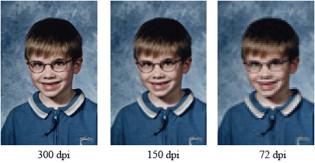
Resolution: The resolution, commonly referred to as dpi or dots-per-inch, means the clarity of the image. The higher the dpi the clearer the picture. To achieve a crisp, clear image on the finished product, 300dpi images are required.
Viewing your proof at 300% will give a good idea of how clear an image will appear on the finished piece.
 |
1.The best file for plastic card printing is cdr(coreldraw), text,symbols, patterns should be all in vector. Special effects like shade, should be converted to bitmap (300dpi)
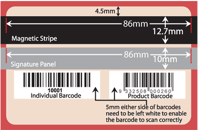
2.Finished plastic card size is 85.5X54mm, If with bleed , size should be 89X57mm. The card coner dia is 12 degree.
3.Regular embossing font is 12pt, Credit card embssing is 18pt. One card can have 19 digitals for pvc card embossing most. Embossing can be gold, silver or other colour if needed.
4.Embossing should be 5mm to the card edge. On plastic card with magetic strip. Magstrip should be 4mm to the edge.
5.When placing embossing, pls pay attention to the magstrip or barcode on the rear.
6.The ideal colour range is 18-85%, if the highlight arear lower than 18% or dark arear higher than 85% the gradence result will not be good. This will ensure the best colour performace for high quality plastic card pritning.
7.The colour mode should be CMYK, black text should use K 100
8.The stroke should be no thinner than 0.076mm. Otherwise it will disappear on the finished card.
9.The transparency of the pattern(image) as background should be no lower than 8% , otherwise, it will disappear.
10. Quantity should be marked on artwork. If use embossing, should clearly note embossing range, for example : from 0001- 1000. Pls also mark embossing type, colour.
11.Due to the different base and printing technology, PC screen or ink jet printed colour is different from the final pvc card.
12.Fonts:
Before sending your files, make sure all fonts are converted to outlines.
13. Included images:
Make sure all linked(placed) images are sent with plastic card artwork, or all linked images are embedded in files.
Plastic card design example:
Plasticcard artwork BEFORE printing
Plasticcard photo AFTER printing |
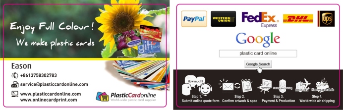
For graphic designers, it is important that you deliver finalartwork in a print ready status to your client. There are several important points for your attention. I am eason, have worked in the artwork department of a card printing factory for a couple of years. So i know a little bit about the print ready artwork process. So i come here to shear my experience with your guys, especially for the freshmen in this field. I am not a native english speaker, so it must be a lot mistakes in my writing. Please understand. Thanks. Ok, let start now.
1. Software, file format: Most plastic card manufacture use coreldraw and illustrator. They accept various file format like: .cdr, .ai,. eps,.tif...etc. Personally i recommend cdr or ai version. Many people export file in pdf, but for some special effect in the artwork, it may affected after plasticcardonline printer import artwork into their software. So it is best that you can supply a very "original" artwork.
2. Vector or bitmap: This is always a very tuff thing for plasticcardonline printers. Many clients supply low resolution photos (Below 300dpi), usually it looks blur in monitor, these files is not good for full colour plasticcard printing. According to my experience, if the photo is small sized one, resolution is not a big problem, some times 72dpi also works. As client like get photo from internet, these photos are always low res at bout 72dpi. If shrink the size to 25% the resolution will be enough. When you design an artwork it is ok to keep photos as bitmap, but make sure the rest text and colored blocks/shapes/linearts are vector. It for the best result for printing, vector artwork can make the printed shapes very sharp and clear. And another thing you need pay attention is if client supply logo as a low resolution jpg file. You have to recreate it , make it vector. No body want their logo unreadable.
3. CMYK,RGB, Spot color: For printing CMYK is the most popular setting. RGB is for web, never use it. And some clients need accurate color, so you have to use spot color for pantone match.
4. Text and font: As i mentioned above. Text must be vector to make sure the best result for printing. You must pay attention when you exporting finalartwork, all fonts must be converted into outlines. Or you must supply used font with artwork. Otherwise, when the plasticcardonline printer open your artwork, the font will change. That is very dangerous. Not only the font, as it changes, the layout may also be affected. So this is quite important and always ignored by some designers. And for some artwork, even it is confirmed currently, you or your client may change the text contact in the near future. For this consideration, do not outline the text, store the font file with artwork. This can save a lot of time. Other wise you may never know what font is.
5. Bleed!Bleed!Bleed! This is the most common mistake for new designers, artwork for plastic card must be NO LESS THAN 3mm. The bleed area must be consolidate with the main artwork , this area will me cut off. When factory do cutting, they can not always cut very accurate. So make sure text, logo never too close to the edge of the card. The following size spec may helps. And if you need vector coreldraw template file, you can download here.
6. Corpmark, cutline: Make sure finalartwork has corp mark shown on artwork, it helps your plasticcard manufacturer locate the cutlines.
7. Signature stirp, mag strip, embossing, sequential number: When you do design, if it has embossing like membership cards. Pay attention to the back, so that embossing area will not affect the signature on the back if it has one. Same are the texts. Embossing text font name is OCR. Thermal printed sequential number is black only. So need pay attention to the background color. If it is too dark, add a white square. Embossing can be gold, silver,black tipped.
8. Silver foil, UV: If you want add silver foil/UV to the plasticcard. Make a separate layer with corp mark. Solid black, so the plasticcardonline printer can locate it correctly.
Clear plastic card design guide
Card Dimensions
Our cards our 86mm x 54mm (3.385’’ x 2.125’’) with rounded corners with a corner radius of 3mm (0.118’’) as shown in the diagram. This shape is fixed. We do not have the ability to die cut plastic cards. The plastic cards are credit card sized as standard.
Ink Coverage
We use a thermal transfer to bond the ink to the plastic. This allows us to use totally opaque colours and
metallic foils on plastic. The downside of this process is that we cannot cover large blocks of areas with ink. As the process uses heat to bond the inks, the more ink you use, the more heat is required to ensure a good bond between ink and plastic. If too much ink is used , the required heat can warp and distort the plastic. Here is a guide as to how much ink you can use in one block. If you still have problems, please submit your design and we will try to find a solution.
Text Size
We like to use a minimum of 7.5pt font size with regular weight sans serif fonts (Futura, Arial, Century Gothic
etc) and 8pt with regular weight serif fonts (Garamond, Times New Roman, Century etc). Using smaller fonts
can result in a problem called ‘filling in’, where characters like ‘a’ and ‘e’ do not form correctly.
Bleed
We can reproduce designs that bleed right to the edge of the card in any ink. We request a 3mm bleed in
cases where the ink needs to run to the very edge of the card.
Colours
We have a set library of colours suitable for use on translucent plastic cards. These include both flat pigment
colours and reflective metallic inks. A rough guide to the colours we have available to us can be found on the
right. Unfortunately we cannot use these inks to create gradients If your logo contains colour gradients, we would need to alter it so that it is compatible.
Touching Inks
If you’re design has two or more colours touching each other, we will need to put a 0.5pt stroke around the
objects so that they do not touch. This reduces the likelyhood of countour lines where the inks overlap. It also reduces the risk of bonding issues sometimes caused by overlapping inks.
Printing on the Reverse
It is very possible to utilise the translucent aspect of the card and print colours on the back. Colours show up very well through the card from the other side, giving a very subtle 3d effect as colours printed on the front will be on a very slightly different level than the inks on the back. It is used mainly so that colours are abe to touch eachother. For example, if a logo absolutely demands that a green must be surrounded by a yellow for instance, we can print the yellow on the back of the card and the green on the front. Two drawbacks for this is that metallic inks cannot be put on the back as the bonding side is very different
from the actual displayed side, and the other drawback is that the same ink front and back of the card must
be charged as two colours as it must go through the print process twice.
Fine Detail
We recommend that lines be no thinner than 0.25mm in width. When we come to create the metal plates
used to apply ink to the plastic, using lines thinner than 0.25mm can result in a jagged, broken finish on very
fine detail. Due to our extensive experience we can help you through this process if you are concerned about the level of detail on your design.
Clear Ink
Clear Ink is used for creating a watermark effect on the frosted plastic card. It works by slightly translucency of the plastic. The result is a wonderfully subtle effect. Used effectively, it can take your design to a new level. The clear ink is regarded as an ink and is charged as an ink colour.
Remember, we are not trying to scare you off with the limitations detailed below! We are happy to work with you, of feri ng advice and our design experience, to ensure your card looks stunning.
Custom options for plastic card:
1. Barcode on the plastic card:
Make sure it is on a light background, if it is a black plastic card, draw a white rectangle before you put the barcode, otherwise the scanner will not be able to read it. For barcode type, C39 and EAN is the most popular. Also for the location of barcode, have to check with client what types of scanner they are using, some types of scanner can only take the barcode close to the edge. If you have to resizing the barcode, please do make it in proportion.
2. Magnetic strip plastic card:
There are 2 types of magnetic strips. High-C0 is for bank card, credit card use, high antimagnetic. Lo-Co is the most popular and cheaper than High-co. If the plastic magnetic card is not for bank use, use lo-co.
3. Hole/Strip punch on plastic card:
Most popular size for a hole is 5mm. Do not too close to the edge of the plastic card. For strip punch for lanyard, make sure the size suits the lanyard, as some lanyards are very thick.
4. Signature strip on the back of the plastic card:
There are 2 types, transparent and plan white. No big difference. Pay attention to the height, if too shot, people will not be able to write on it.
5. Flat numbering, sequential numbering on plastic card:
It is usually used for membership card number. There are 2 types, spray printed and thermal printed. Spray printed is digits formed by tiny dots. Thermal printing is the normal one. Pay attention the background for flat numbering should not be too dark, as these numbers can only be black. Black numbers will be unreadable on dark background. Flat numbering can also be words, which are for ID card use.
6. Embossing on plastic card:
This can be done with a embossing machine easily. And the color can be gold, silver and black. It depends on the design of the card. Embossing can be capitalized characters and numbers. Do not exceed 21 digits in 1 line. And too many embossed characters, the card will bend. Also embossing will affect the printed text on the back. It will make them unreadable.
That all i have recently , i will keep updating this guide hope it is helpful with the new guys. Any body who want to give me suggestions or need help , please contact us.
|
|